The Story Behind the NexusBlock Dial
Designing a watch dial often begins with a simple question: how can information be displayed clearly while still giving the watch a distinctive identity?
For the Revival Edition, the dial became one of the most important elements of the entire design process. It needed to remain highly legible while also establishing visual details that could become part of the Nexus Elgin design language.
The result is what we now call the NexusBlock dial architecture.
Legibility Comes First
Tool watches have always prioritized clarity and readability. The dial must be easy to interpret in different lighting conditions and at a quick glance.
For the Revival Edition, this meant using applied hour markers with strong dimensionality and generous luminous application. Raised markers interact with light throughout the day while maintaining excellent visibility at night.
The shape of the indices was developed to create clear geometry that could also become recognizable across future Nexus Elgin models.
The NexusBlock Indices
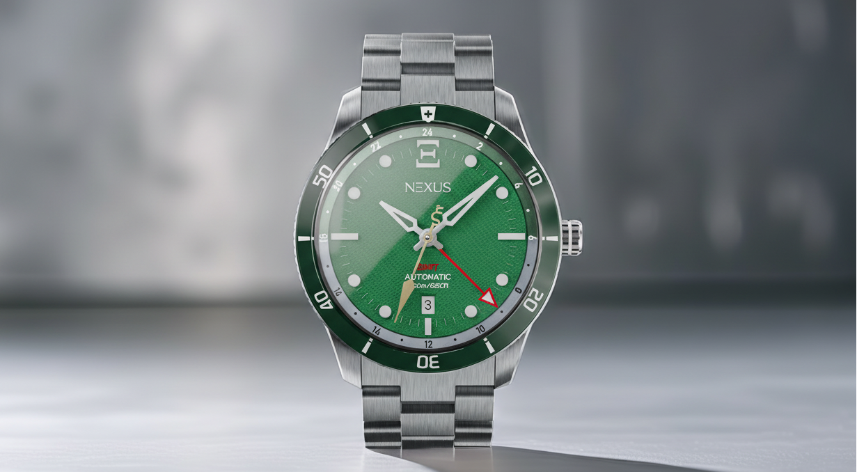
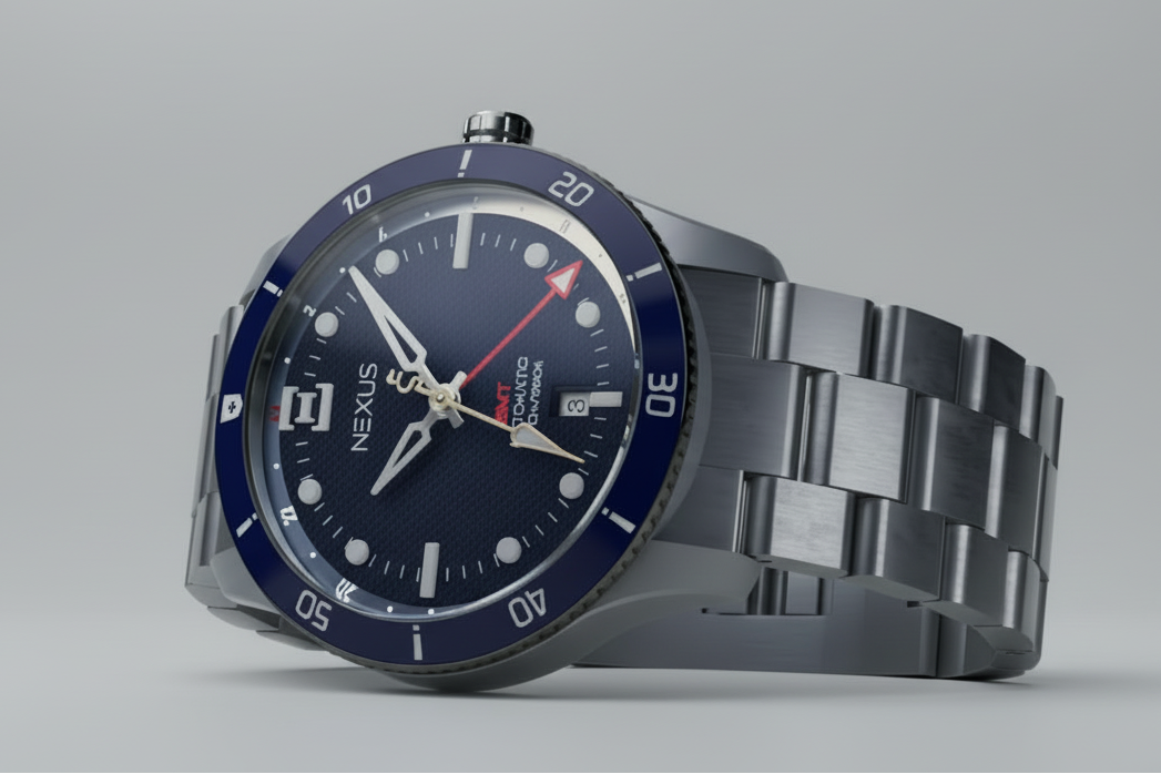
The hour markers used on the Revival Edition are what we refer to as NexusBlock indices.
Rather than thin markers or printed lume plots, the NexusBlock design uses solid applied blocks that emphasize depth and structure across the dial. This approach provides two advantages.
First, it creates a stronger visual presence when viewed in natural light. Second, it allows for a larger luminous surface, improving nighttime legibility.
Over time, the NexusBlock indices are intended to become a signature feature of Nexus Elgin watches.
The 12 O’clock Marker
Every watch dial needs an anchor point. For many watches this is simply a larger marker at twelve o’clock.
For the Revival Edition, the twelve marker incorporates the NexusBlock logo geometry, creating a distinctive focal point at the top of the dial. This detail not only helps orient the watch quickly but also reinforces the visual identity of the brand.
Small details like this often become the features that owners recognize instantly.
The Saltire Dial Structure
Beneath the indices lies a subtle structural element that adds depth to the dial.
The Revival Edition uses a saltire-inspired dial structure, a cross pattern that gently guides the eye toward the center of the watch. Rather than dominating the design, the structure becomes visible as light moves across the dial surface.
This layered approach creates visual interest without sacrificing legibility.
A Recessed GMT Track
Because the Revival Edition is a GMT watch, a 24-hour scale was necessary to track a second time zone.
Instead of placing this track on the outer edge of the dial, the design recesses the two-tone GMT track slightly below the main dial surface. This subtle step introduces an additional layer to the dial architecture while keeping the information easy to read.
The two-tone color treatment further distinguishes day and night hours.
A Foundation for Future Designs
While the Revival Edition is the first Nexus Elgin watch, the design language introduced here will help shape future models.
The NexusBlock indices, the saltire dial structure, and the layered dial approach all form part of a visual framework that can evolve over time.
Every brand begins with a first design. The Revival Edition represents that starting point.
Join the Revival
Nexus Elgin is preparing to launch the Revival Edition in Summer 2026.
Join the early access list to follow the project and receive updates as the brand continues to take shape.