When the Sample Arrives and the Spec Is Wrong
When you're developing a watch you make hundreds of small decisions. Most of them hold up. Some of them don't, and you only find out when the physical sample is sitting in front of you under real light.
That happened recently with the Revival Edition dial.
What the spec said
The original specification called for white markers and white dial text on a grey dial. On screen it looked clean. On the manufacturer's reference samples it looked clean. On paper, every decision made sense.
The grey dial was a deliberate choice. Grey sits between the warmth of silver and the depth of slate. It catches light differently depending on the angle, something we specifically wanted from the Saltire crosshatch texture. The white markers were meant to sit on top of that, crisp and legible, the way they appeared in every render we reviewed.
Watches are designed on screens. Approved on screens. Iterated on screens. The problem is that a screen emits light. A dial reflects it. Those are two fundamentally different things, and no amount of time staring at a monitor tells you how a color decision will behave on a physical textured metal surface under real-world light conditions.
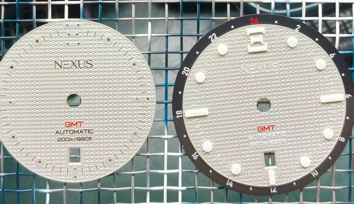
What the sample showed
When the first production dials arrived from our manufacturing partner, the problem was immediately visible.
White markers on a grey textured dial didn't have enough contrast. The dial structure, the Saltire crosshatch we'd spent months developing, was working against legibility instead of for it. The texture that catches light so well in person was washing out the marker definition. The dial lost its hierarchy. At a glance, it wasn't reading the way a tool watch dial needs to read.
Legibility is non-negotiable on a watch. It's not a preference or an aesthetic choice. A watch that you have to look at twice to read the time has failed at its primary function. That's not the Revival Edition.
The decision
We changed the markers and dial text to black.
The result was immediate. Black on grey delivers the contrast the dial needs. The hierarchy is clear. The depth that the crosshatch texture creates now works with the markers instead of competing with them. The dial holds its structure.
We also adjusted the GMT track while we were at it. The light half of the track was too close in shade to the dark half, the two zones weren't reading as distinct enough. We lightened it a shade. Two clear zones now. Exactly as a GMT track should read.
Both changes were approved. The corrected spec went back to the factory.
Why this matters
This is what product development actually looks like. The gap between what looks right on a screen and what reads correctly on a real surface is something you can't fully anticipate, you can only respond to it when you see it.
Some brands would ship the original spec and hope nobody notices. Some would delay the project and treat it as a setback. We caught it on a first-iteration sample before production runs, which is exactly when you want to catch it. That's why you make samples.
The 3D NexusBlock lume markers and the dial texture look exceptional in person, the crosshatch catches light in a way that's genuinely hard to capture in a photo. When the corrected samples arrive, you'll understand what we mean.
Production is on track. More updates coming.